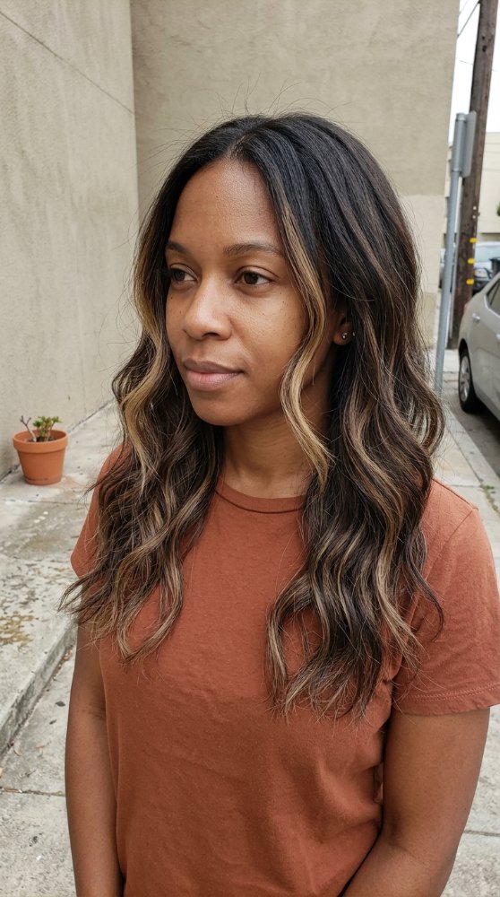
Pink Hair Color Ideas: Complete Styling Guide for Different Bases, Placements, and Upkeep Levels
Pink hair can look delicate, electric, smoky, warm, cool, or almost red depending on the shade and where the color sits. The more useful decision isn’t simply which pink photograph you like. It’s whether your current base can support that pink, how much contrast you want, and what kind of fading you’re prepared to manage.
Very pale pinks usually depend on a light, fairly even canvas. Deeper berry, raspberry, fuchsia, and magenta tones have more visual strength and can make sense when you don’t want the entire result to depend on reaching a very pale base. Existing artificial color, previous lightening, porosity, and hair condition can change what is realistically achievable.
Placement matters just as much. A full head of bubblegum pink behaves differently from a narrow face frame, dark-rooted rose balayage, or a concealed panel underneath brunette hair. One changes your entire color identity; another gives you pink that appears mainly through movement.
Use the ideas below as consultation directions, not color formulas. The most convincing choice is the one that works with your starting hair and the amount of upkeep you actually want.
Soft Pink Hair Colors
Blush Pink
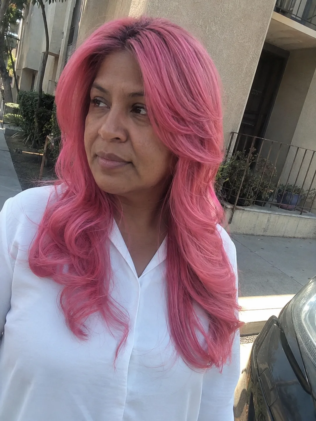
Blush pink is one of the quietest ways to wear the color. Think pale pink with enough softness that the hair can look almost neutral from a distance, especially in diffuse light. The effect depends heavily on the canvas underneath. Uneven warmth or darker bands can show through a delicate shade far more clearly than they would beneath a stronger pink.
This direction is especially attractive on a bob, lob, or smooth shoulder-length cut because the restrained color lets the haircut remain visible instead of overpowering it.
The tradeoff is delicacy. Very soft pink has little pigment depth to disguise tonal changes as it fades. It makes the most sense when you value an airy finish enough to accept that the color may need more attention than a saturated berry shade.
Dusty Rose
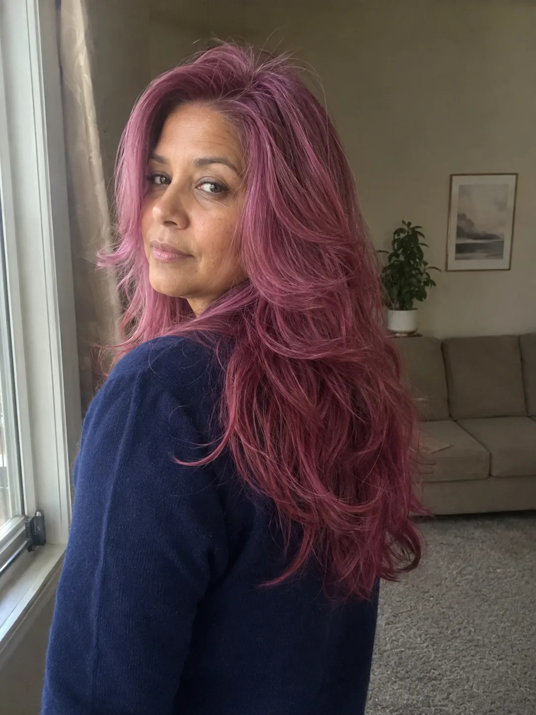
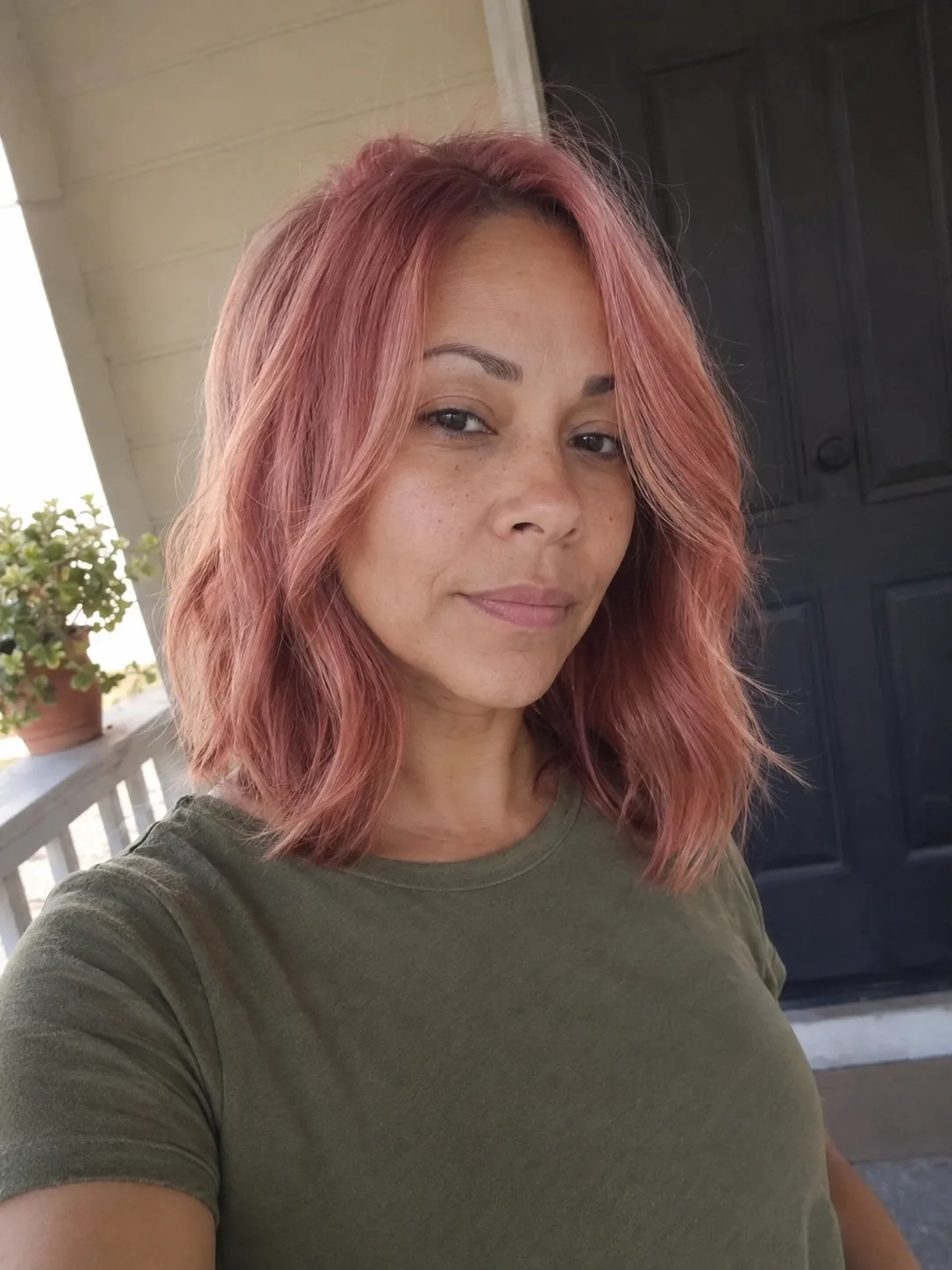
Dusty rose takes pink in a muted direction, usually with a smoky or subdued quality that prevents it from reading candy-bright. It works particularly well when you want obvious fashion color without the visual sharpness of hot pink.
Texture changes the impression. On loose waves, the muted tone can shift between pink and mauve as the hair bends through the light. On straight hair, the same color reads cleaner and more uniform. Dusty rose is a stronger choice than very pale blush for someone who wants softness but still wants the pink to remain clearly recognizable.
Rose Gold
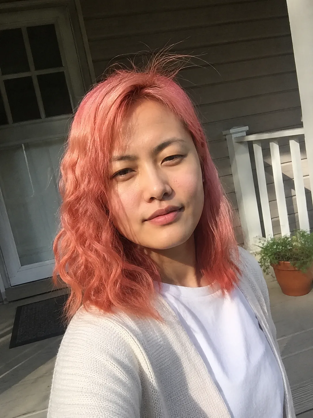
Rose gold sits between pink and warm metallic beige, peach, or copper territory. That makes it useful for readers attracted to pink but reluctant to commit to a distinctly cool or sugary finish.
The balance matters. Too much warmth moves the color toward peach or copper; too much pink changes the character entirely. Your starting base also affects how luminous or muted it appears.
Rose gold earns its place because it can connect naturally with warmer blonde lengths and dimensional color. Instead of covering every strand with one flat pink, the colorist can preserve tonal variation so lighter pieces flash pink while deeper areas provide contrast.
Pastel Pink With a Shadow Root
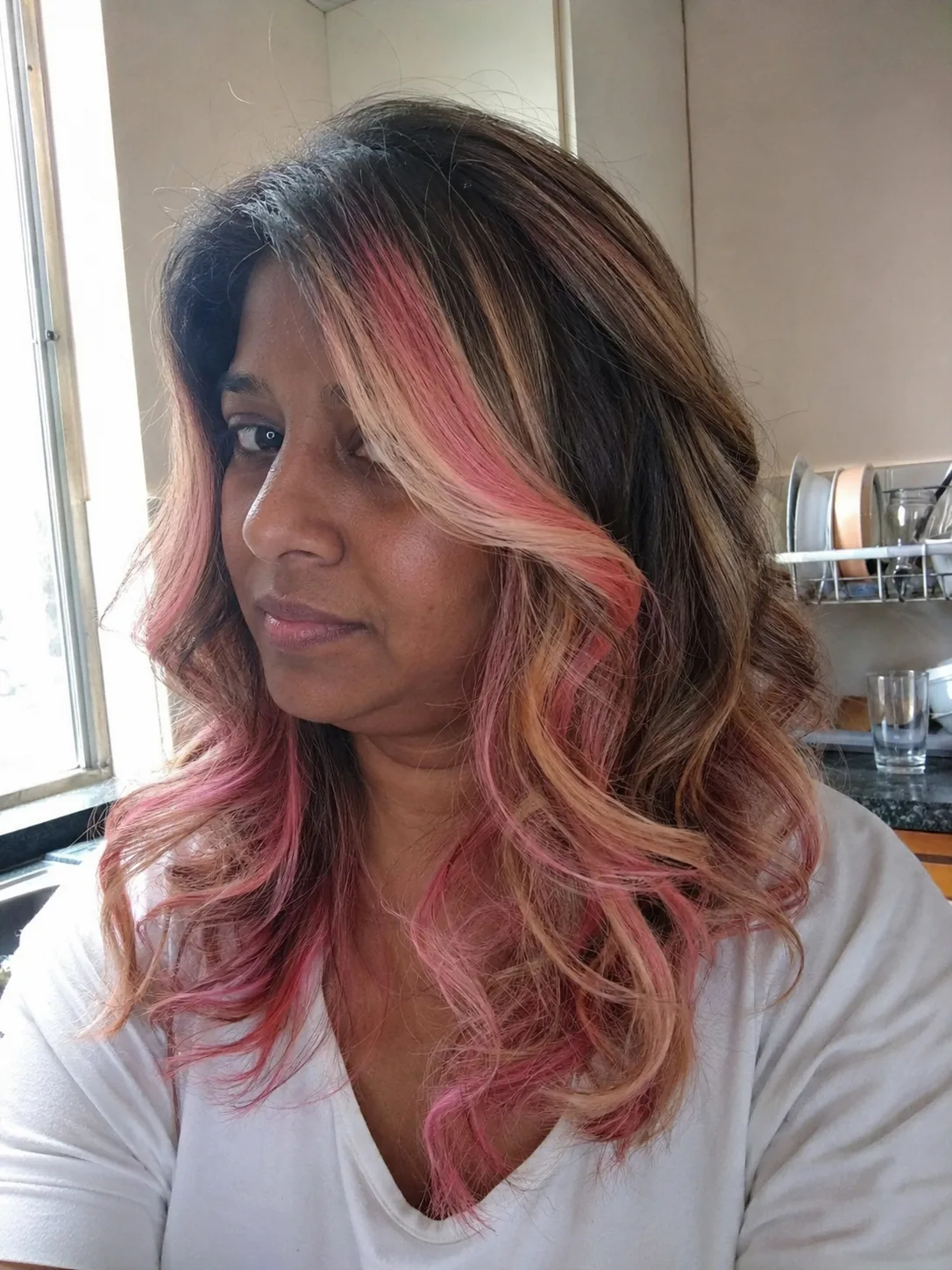
A deeper natural-looking root changes pastel pink from an all-over color project into a more forgiving grow-out design. The scalp area remains darker, then the pink begins farther down the strand.
This is particularly useful when you love pale pink lengths but don’t want a visible line of new growth to dominate the style immediately. The root also gives the pastel more visual depth.
The transition needs to look deliberate. A hard dark-to-pale boundary can create a banded effect, while a controlled blend lets the pink appear connected to the darker base. On curly or wavy hair, that transition often looks even softer because the color boundary moves through bends rather than sitting in one straight horizontal line.
Bright Pink Hair Color Ideas
Bubblegum Pink
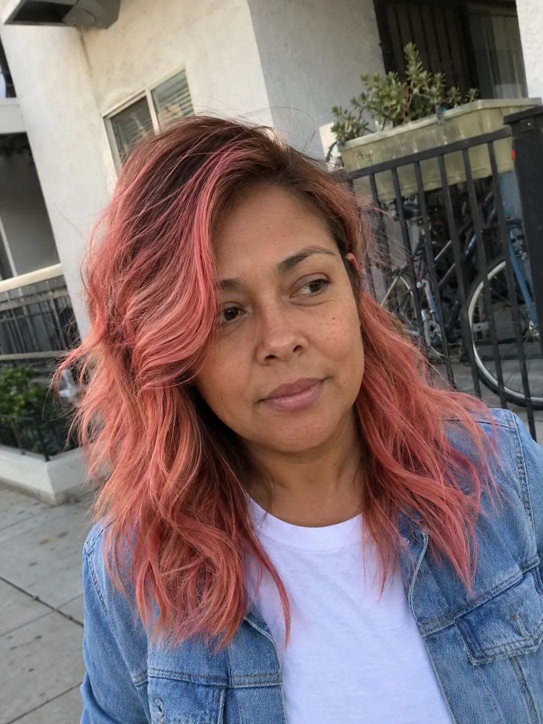
Bubblegum pink is bright, cheerful, and unmistakably pink without necessarily reaching neon intensity. It gives blunt cuts and smooth lengths a graphic quality because there isn’t much visual ambiguity about the shade.
This color is worth choosing when pink itself is the main feature. It asks for more commitment than a hidden panel or ombré because the color covers a large visible area, and regrowth becomes part of the look rather than staying concealed underneath other hair.
Hot Pink
Hot pink has enough saturation to compete with a dramatic haircut instead of disappearing into it. Pixies, blunt bobs, long straight hair, and defined curls can all carry it, though each produces a different effect.
On short hair, the color puts more attention on the cut’s outline because there is less length to diffuse the intensity. Longer hair creates a larger field of color and makes fading through the mid-lengths and ends more noticeable.
Hot pink is one of the stronger choices when you want impact without depending on the translucent quality of a pastel. Previously processed or uneven hair still needs careful assessment; stronger pigment doesn’t erase differences in condition or porosity.
Neon Pink
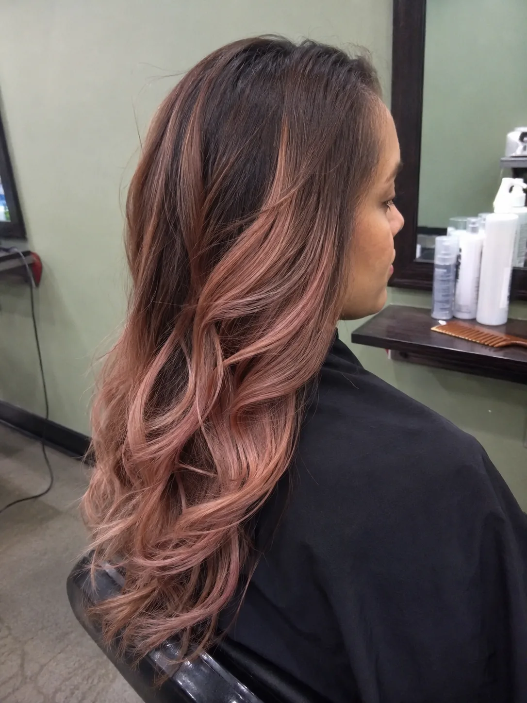
Neon pink is the high-visibility version of the trend. It performs best when the goal is deliberate brightness rather than subtle dimension.
Photographs can make neon color look uniformly luminous, but real hair has shadows, root depth, texture, and varying light exposure. Coils and curls create darker recesses between groups, while straight hair presents a broader uninterrupted surface.
This is a poor match for someone hoping the color will quietly blend into a conservative natural palette. Choose it because you want the pink to dominate.
Fuchsia Pink
Fuchsia pushes pink toward a cooler, purple-influenced direction. It has more depth than pastel pink and feels richer than bubblegum.
That extra depth is useful on long or highly textured hair because the shade remains visible through shadowed areas. Defined curls can show several apparent values of the same color, with brighter pink across the curve of a curl and deeper violet-pink in the interior.
Fuchsia also pairs well with strategically retained dark roots. The contrast feels deliberate rather than unfinished because both tones have enough strength to hold their own.
Raspberry Pink
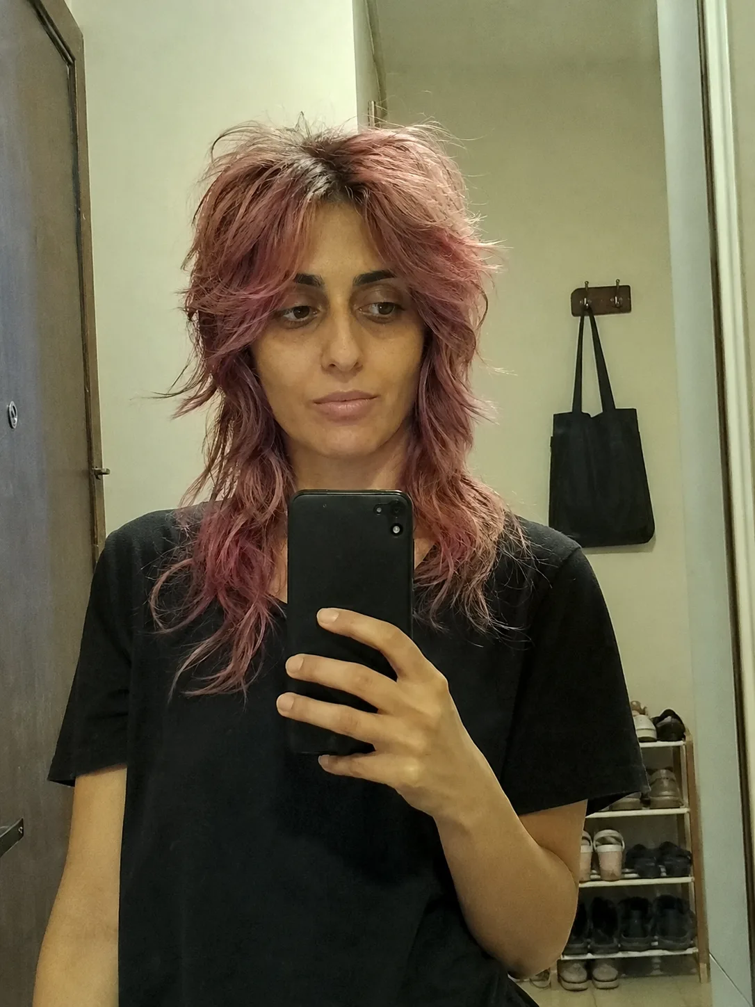
Raspberry brings a red-berry influence into pink. It feels warmer and deeper than fuchsia but less orange than coral.
This is an underrated option for anyone who finds pastel shades too delicate and neon pink too loud. Raspberry has enough visual weight to work across larger sections without looking washed out, and it can create a rich result on waves, curls, or layered cuts.
Because it sits near the border between pink and red, bring a reference that shows the exact balance you want. Two people saying raspberry may be picturing noticeably different colors.
Deep Magenta
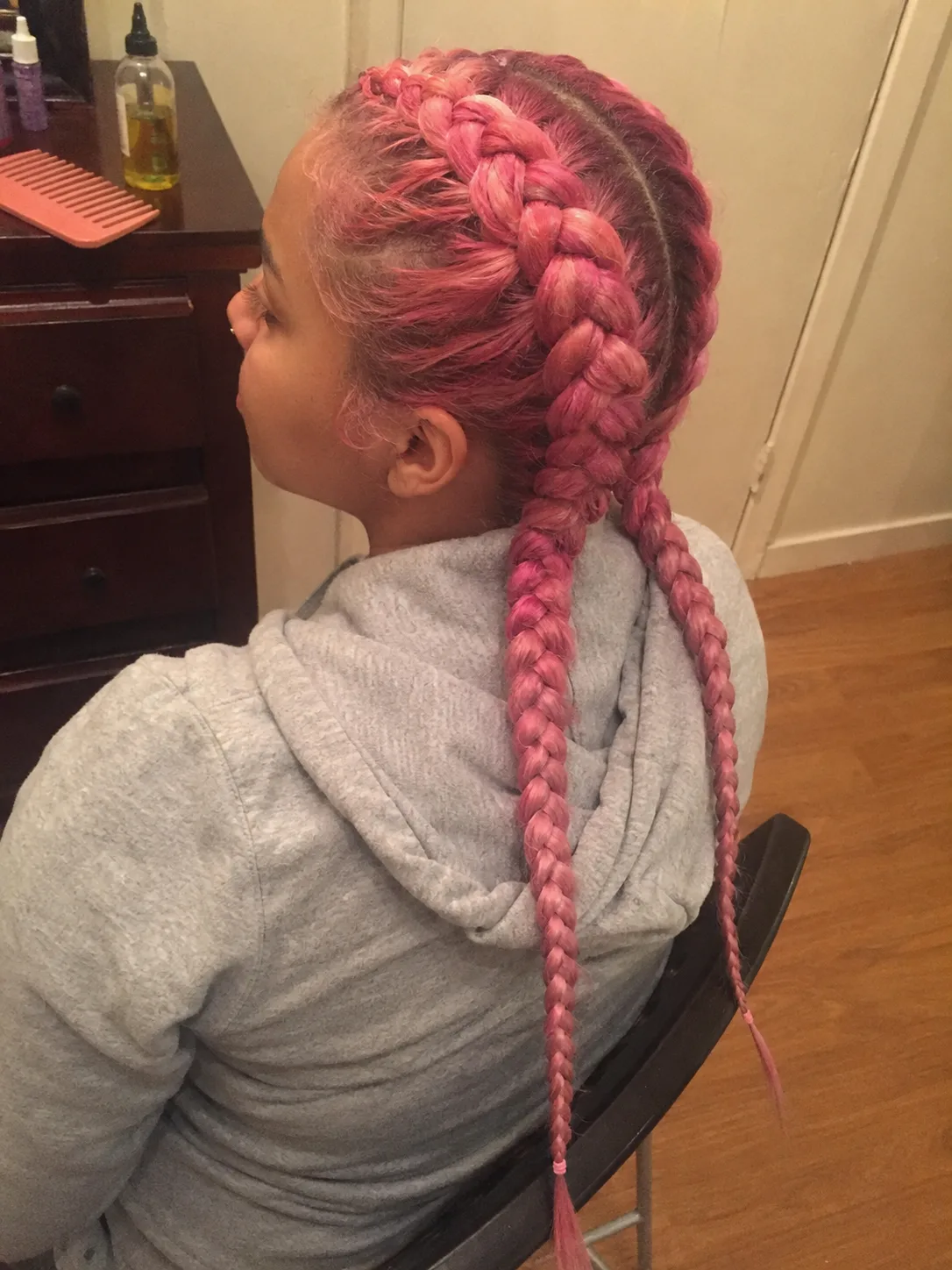
Deep magenta is one of the most substantial pink families. The result leans toward pink-purple and has enough depth to remain dramatic without the light, candy-like effect associated with pastels.
The stronger pigment makes long hair look particularly rich because shadows through the underneath layers add dimension instead of simply making the color disappear.
Magenta is also a practical comparison point during a consultation. Someone requesting bright pink may discover that a deeper magenta better suits the starting base, condition, or preferred upkeep. That conversation is more useful than pursuing the palest possible canvas simply because the inspiration photo happens to be lighter.
Pink Placement Ideas That Keep Some Natural Color
Pink Face-Framing Pieces
Two pink sections around the face give you strong visibility without coloring the entire head. They can begin close to the root for a bold block effect or blend into surrounding hair more gradually.
This placement works because the color stays near your line of sight. Even a relatively small amount of pink can have a large visual effect.
It also creates a clear decision at the salon: how wide should the pink sections be? Narrow pieces read as accents. Wider panels can visually reshape the front of the hairstyle and become nearly as dominant as an all-over color from certain angles.
Hidden Pink Underlayer
A hidden underlayer keeps the surface color relatively restrained while placing pink beneath it. The pink appears when the hair moves, is tucked behind the ears, or is worn half-up.
This is one of the more practical ideas for someone who wants two different styling personalities from the same color. Wear the hair down and the natural or conventional top layer dominates. Lift or separate the upper sections and the pink becomes obvious.
Haircut density affects visibility. Thick surface coverage can conceal most of the underlayer, while layers or lower density may reveal it much more readily. Decide how hidden you actually want the color to be before choosing the section size.
Pink Peekaboo Panels
Peekaboo panels are more deliberate and localized than a broad underlayer. Pink is placed in selected interior sections so flashes appear between the surrounding hair.
Movement is part of the design. Straightening can show the panels as cleaner stripes, while curls and waves break them into irregular flashes.
Peekaboo placement is especially useful when the surrounding hair is dark because the contrast can be dramatic without requiring every section to become pink. It still may involve lightening the selected pieces depending on the visible target and starting base.
Pink Dip-Dyed Ends
Keeping pink primarily on the ends creates a clear color boundary and leaves most of the natural or existing base untouched visually.
The strongest version looks intentionally graphic: brunette, black, blonde, or another base above, then unmistakable pink at the bottom. A softer blend moves closer to ombré.
Ends deserve extra attention before a major color change because they’re often the oldest portion of the hair and may carry previous chemical or heat-related wear. Transparent, fragile ends won’t become stronger because a vivid shade is added. Sometimes refining the perimeter improves the finished color more than trying to preserve every bit of length.
Pink Money Piece With Natural Lengths
A money piece concentrates pink at the front while leaving the majority of the length in its existing color. Compared with a full face frame, it can be narrower and more deliberately separated from the surrounding hair.
This works particularly well with ponytails, buns, and half-up styles because the front pieces remain visible even after the back is gathered.
The look also gives you an easy test of whether you enjoy seeing vivid color around your face every day. Pink near the hairline is visually prominent in mirrors, photographs, and video calls even though it occupies only a small percentage of the hair.
Pink Tips on a Short Cut
Short hair doesn’t need a large block of color to show pink clearly. Concentrating the shade on the tips of a textured pixie, crop, or short layered cut lets the base stay darker while the outermost pieces catch the color.
The haircut determines where those pink tips appear. Longer crown pieces create more visible flashes; a very close cut offers less surface area.
This option is more haircut-dependent than long dip-dyed ends. As the shape grows, the colored area shifts in relation to the cut, so future trims and color placement need to be considered together.
Pink Dimension Instead of One Flat Shade
Pink Balayage on Dark Hair
Pink balayage uses lighter or brighter ribbons through a darker base instead of converting the entire head to pink. The result can range from subtle berry pieces to strong magenta contrast.
Dark natural roots provide depth, which can make waves and layers appear more dimensional. The placement is especially visible where the hair curves or separates.
The important consultation issue is what needs to happen underneath the pink. Dark hair may need lightening in selected areas to make a vivid target visible, and artificial dark pigment can respond differently from untouched natural hair. Condition and chemical history should guide how ambitious that transformation becomes.
Pink Ombré
Pink ombré gives the color a clear vertical progression. A darker root or mid-length gradually transitions toward pink through the lower portion of the hair.
This is the stronger choice over all-over pastel when root maintenance is your main concern. New growth belongs naturally beside the darker top area instead of interrupting a pale color at the scalp.
The length of the transition changes the impression. A long blend produces a softer gradient. A shorter transition creates more contrast and makes the lower pink area look almost color-blocked. Long hair offers more space to show that progression, while a bob requires tighter placement decisions.
Blonde Hair With Pink Ribbons
Instead of covering blonde hair, selected ribbons can be tinted pink while other blonde sections remain visible. This keeps brightness and dimension rather than turning the entire head into one uniform shade.
Fine highlights produce a scattered pink effect. Broader ribbons become obvious blocks, especially on straight hair.
This approach can be visually flexible because the remaining blonde changes how much pink you perceive. More blonde makes the result lighter overall; larger pink sections pull the whole hairstyle toward fashion color. Existing blonde still needs condition assessment, particularly where previous lightening has left the lengths more porous.
Pink and Purple Melt
Pink flowing into purple creates dimension through hue rather than simply through light and dark values. The two colors can sit in separate sections or transition through the lengths.
A cooler fuchsia-to-violet combination looks cohesive because the colors share related undertones. Warmer pink paired with a cool purple creates stronger contrast and a more graphic result.
This is worth the extra complexity when you genuinely want multicolor hair. Someone primarily interested in pink may find a single well-chosen shade easier to maintain visually as it fades. With two fashion colors, changes in either tone can alter the balance of the whole design.
Pink and Peach Melt
Pink and peach create a warmer blend than pink and purple. The combination can move through blush, coral, apricot, and rose territory depending on the balance.
Waves show this particularly well because sections overlap and expose different colors throughout the bend. On sleek hair, the placement becomes easier to read and any abrupt transition is more obvious.
A peach-pink melt makes sense for readers who love warm fashion color but find true bubblegum or cool fuchsia too sharp. It also provides more tonal variation than a single rose-gold shade.
Half Pink, Half Natural Split Color
Split color is the most graphic placement in this list. One side remains natural or another base color while the opposite side becomes pink, creating an obvious division through the part.
This choice demands precision because the boundary is part of the design. Changing the part can disturb the clean half-and-half effect, and pulled-back hairstyles reveal how the two color fields meet around the crown and nape.
It also creates an unusual maintenance advantage and disadvantage at the same time. Only part of the head carries the pink transformation, but any mismatch in fading between the two sides is easy to see because the contrast is intentional. This is the strongest choice for someone who wants color blocking, not a subtle introduction to pink.
Which Pink Direction Fits Your Routine?
Pink color becomes easier to choose once you separate shade from placement. A pale all-over color and a pale hidden panel may use a similar hue, yet they create very different commitments.
An all-over pastel makes the greatest demand on base consistency because the pale shade exposes differences across the hair. Rooted pink, balayage, and ombré are more forgiving visually because depth is intentionally part of the design.
For a first move into fashion color, a face frame, underlayer, or defined lower section is often the more practical starting point. You still get unmistakable pink without making every future styling and color decision revolve around it.
Someone who already knows they want pink to be their main hair color can justify the work of bubblegum, hot pink, fuchsia, or an all-over dusty rose.
Your Starting Hair Color Changes the Plan
Pink placed over hair doesn’t exist independently from the pigment underneath it. The base contributes to the visible result, especially with translucent or pale fashion shades.
Very light hair offers the most obvious canvas for blush, baby pink, and other pastel directions. Remaining yellow or warm tones can shift a pale pink warmer. Uneven lightness can also produce areas that look more saturated than others.
Medium and dark hair create a different decision. Deep magenta, raspberry, and selected pink accents may fit the starting point better than chasing a nearly white-blonde canvas solely to reproduce a pastel photograph. A colorist can assess how much lightening is actually necessary for the target.
Previously colored hair needs its own conversation. Permanent dark color, previous highlights, old fashion pigment, relaxers, or other chemical services change what the hair can reasonably tolerate and what color may be exposed during the process. A photograph tells you the destination; your chemical history determines the route.
Curly and coily hair also needs assessment in the state you normally wear it. Shrinkage changes where balayage and ombré placement appears, while curl grouping affects how highlight ribbons separate visually. Color planning should account for both the stretched length and the finished curl pattern rather than treating texture as an afterthought.
What Pink Hair Photos Usually Hide
A freshly photographed pink color is only one moment in the life of the shade. Fashion pigments change as you cleanse, style, expose the hair to the environment, and simply live with the color.
Porous areas can accept and release pigment differently from stronger sections. Ends may fade differently from roots or mid-lengths. Two pink shades used in one design can also drift at different rates, changing the original balance.
Lighting makes another enormous difference. Cool indoor light, warm evening light, direct sun, and camera processing can make the same pink appear mauve, coral, red, or nearly neon. Save several reference images that show the color in different lighting when possible instead of relying on one highly edited photograph.
Texture affects perception too. Sleek straight hair displays the color as a broad continuous surface. Waves introduce alternating light and shadow. Tight curls and coils break the color into smaller visible planes, so a shade can appear deeper in some areas even when the formula itself is consistent.
Maintaining Pink Without Building Your Entire Routine Around It
Color maintenance starts with deciding how much fading you can tolerate. Some people enjoy the progression from saturated pink into a softer version. Others want the original intensity maintained as closely as possible. Those are different expectations.
Use cleansing and styling choices that make sense for your scalp, hair condition, and color goals rather than following a universal wash schedule. Repeated high heat and aggressive handling can add unnecessary stress to already lightened hair, so technique and condition matter more than chasing one prescribed temperature.
Color-depositing products can sometimes refresh a pink tone, but they should match the shade you actually want. Adding more pink indiscriminately can muddy a deliberately peach, rose-gold, or mauve result.
Lightened hair may also need a care routine focused on manageability and reducing unnecessary breakage. Color doesn’t create damage by itself in one simple way; the full chemical history, starting condition, lightening demand, heat habits, and handling all contribute to how the hair behaves afterward.
Pay attention to the ends. A vivid pink perimeter looks stronger when the ends themselves are in good condition. Severely transparent or breaking ends can make even beautiful color look less finished.
What to Discuss at a Pink Hair Consultation
Bring photographs for color and placement separately. You might love the fuchsia shade in one image but prefer the rooted placement in another. Separating those decisions helps clarify the request.
Then discuss your current base, artificial color history, previous lightening, and any chemical services. Be specific about areas that have been repeatedly colored even when they now look uniform.
Ask how the chosen pink is expected to behave on your actual starting hair. A useful consultation should distinguish the visible target from what is safely realistic rather than promising that every inspiration photo can be reproduced exactly.
Also decide what you want the grow-out to look like. Someone comfortable with natural roots appearing through a pink balayage has a different maintenance plan from someone choosing pale pink from scalp to ends.
Finally, describe how you normally wear your hair. Ponytails, curls, silk presses, braids, side parts, and center parts expose color placement differently. A hidden panel that looks perfect with loose hair may become a major visible block once the hair is gathered.
Related Hairstyles to Explore
FAQs
Can I get pink hair without bleaching it?
Possibly, depending on your starting color and the pink you want. Deep pink, berry, or magenta tones may be more visible on a deeper base than a pale pastel, but the underlying hair color will influence the result. Very light blush and pastel pinks generally require a sufficiently light canvas to appear as intended. Previously colored hair can complicate lightening, so chemical history should be assessed before deciding on the target.
Which pink hair color is easiest to grow out?
Placement usually matters more than the exact pink shade. Rooted color, balayage, ombré, hidden panels, and pink ends allow natural new growth to remain part of the design. An all-over pale pink from the scalp creates a more obvious contrast as the roots grow.
Does pink work on curly and coily hair?
Yes. Pink can look striking on curls and coils, from small accent sections to full vivid color. Curl grouping, shrinkage, porosity, and the state in which you normally wear the hair affect how placement appears. A balayage or panel should be planned with the finished curl pattern in mind rather than judged only while the hair is stretched.
What pink shade works well with dark roots?
Fuchsia, raspberry, magenta, hot pink, and stronger rose shades create clear contrast against dark roots. Pastel pink can also work with a dark shadow root when a high-contrast result is intentional. The better choice depends on whether you want the root transition to look soft or deliberately graphic.
Will pink fade into another color?
The direction of fading depends on the pigment used, the starting base, porosity, previous color, and routine. A warm pink may appear peachier as intensity drops, while some cooler pinks can move toward a softer rose or mauve impression. Uneven porosity can also make different sections change at different rates.
Is pink hair a good idea for damaged or breaking hair?
The condition of the hair should guide the service. Breakage is strand damage, and further lightening can create more stress when the hair is already compromised. A deeper pink on the existing base, a smaller colored section, a less ambitious target, or postponing additional chemical processing may be more appropriate. Concerning breakage, sudden shedding, scalp pain, redness, or sores deserves assessment by an appropriate qualified professional.
Hair Texture & Upkeep Style Matcher
Select your natural hair texture and daily maintenance window to get an instant styling formula and heat safety cap.
Heat Cap: 320°F (160°C)
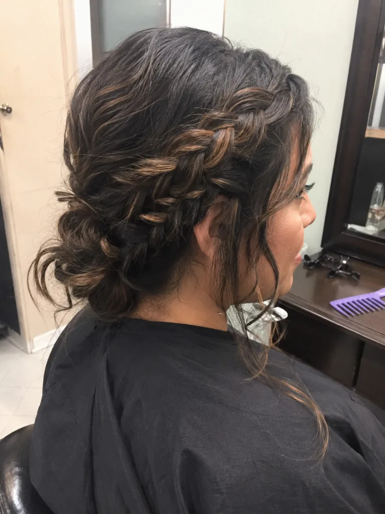
A versatile three-strand braid beginning at the parietal ridge, securing the top half while allowing natural wave texture to flow freely around the shoulders.
Conclusion
The most useful pink hair color idea is the one that gives you the effect you want without requiring a transformation your starting hair can’t reasonably support.
Pastel blush and bubblegum pink make sense when a light canvas and frequent color awareness fit your plans. Raspberry, fuchsia, and magenta provide richer alternatives when you want stronger depth. Pink balayage, underlayers, face frames, ombré, and colored ends give you another route entirely: keep more of your existing hair visible and make placement do the work.
Choose the shade, placement, and grow-out together. That gives your colorist a far clearer target than simply asking for pink hair.
Editorial Standards & Hair Health Guidance
Every style featured on Tress Atlas is curated with a focus on real-world wearability, scalp tension management, and cuticle preservation. When trying protective styles or tight updos, ensure perimeter hairline sections remain tension-free to avoid traction stress on delicate follicles. For heat styling, cap tools below 350°F (180°C) to prevent thermal keratin denaturation.
Scientific Sourcing: Practices aligned with the American Academy of Dermatology (AAD) on traction alopecia risk reduction and cosmetic trichology research on hair tensile strength.